Abstract Wear Online Archive
Art Direction | Web Design | Fashion Design | Animation
This archive documents the results of artistic research in the field of fashion design, carried out over several years within the Lisa Shahno Abstract Wear brand.
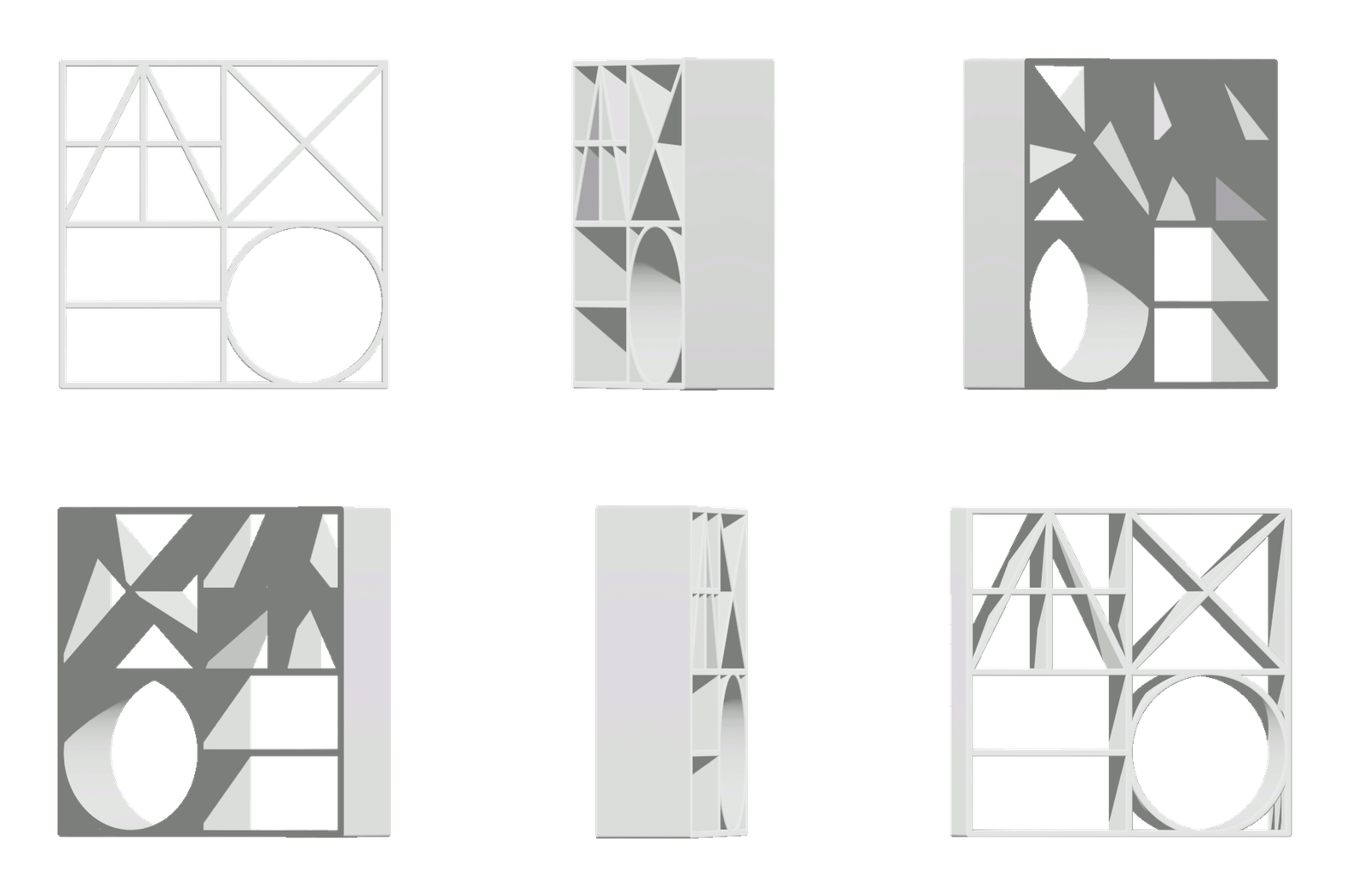
The study was guided by the visual language of elementary geometric forms. Each designed object originated from a common starting point: an abstract grid divided into varying numbers of squares, rectangles, or triangles. This approach freed the narrative of the pieces from the utilitarian meanings typically associated with clothing.
The process of detachment, in turn, was intended to provoke a contradictory dialogue between the familiar perception of the human body and the abstract, minimalist shapes.
Logo
Read more >>>
Logo is based on the Cyrillic transcription of the surname SHAHNO and consists of five letters of the Cyrillic alphabet (ШАХНО). These letters were simplified into basic structures inspired by the grid of the Roman Capitalis Monumentalis. The first two letters of the surname were merged into a single module, which, together with the remaining three letters, forms a square word-image block.

STRUCTURE
- The layout of the site is based on a responsive six-column grid built with Flexbox.
- Below the header, a slideshow displays three looped images.
- The content is organized into three chapters: Sets, Objects, and Speculative Pop-up Store.
- Each chapter’s elements are presented as a series of cards with a mouseover effect.
VIVID PURPLE
#8100FF
BLACK
#000000
WHITE
#FFFFFF
GRAY
#A3A3A3
Colors & Font Family
Read more >>>
The site’s color language is achromatic: its protagonists are black, white, and gray. Despite the colorless appearance—defined by generous white space and minimalist compositions of black lines—purple accents are also present. These accents become visible when the cursor hovers over text elements in the header or footer.
JOST font family was chosen for the site, inspired by the “geometric” sans-serif linear antiquas developed in the early twentieth century. Its letterforms are closely related to basic geometric shapes and align with the project’s overall visual language.
JOST font family was chosen for the site, inspired by the “geometric” sans-serif linear antiquas developed in the early twentieth century. Its letterforms are closely related to basic geometric shapes and align with the project’s overall visual language.


Subpages architecture
Read more >>>
All subpages share the same layout: at the top, a large image displays a photographed 3D item alongside its unfolded 2D construction. Below are previews of other images from the same project, and at the very bottom is a description block.
The subpages are grouped into three chapters:
The subpages are grouped into three chapters:
- SETS /SET/ – experimental fashion collections
- OBJECTS /OBJ/ – individual fashion items
- SPECULATIVE POP-UP STORE /THNG/ – a conceptual installation exploring the ambiguity of words related to clothing


